
Label design
Client: Intermarché
Designer: Ana Clemente Design
3D: Ana Clemente Design
Studio: Ana Clemente Design
Year: 2025
Follow: @_ana.clemente
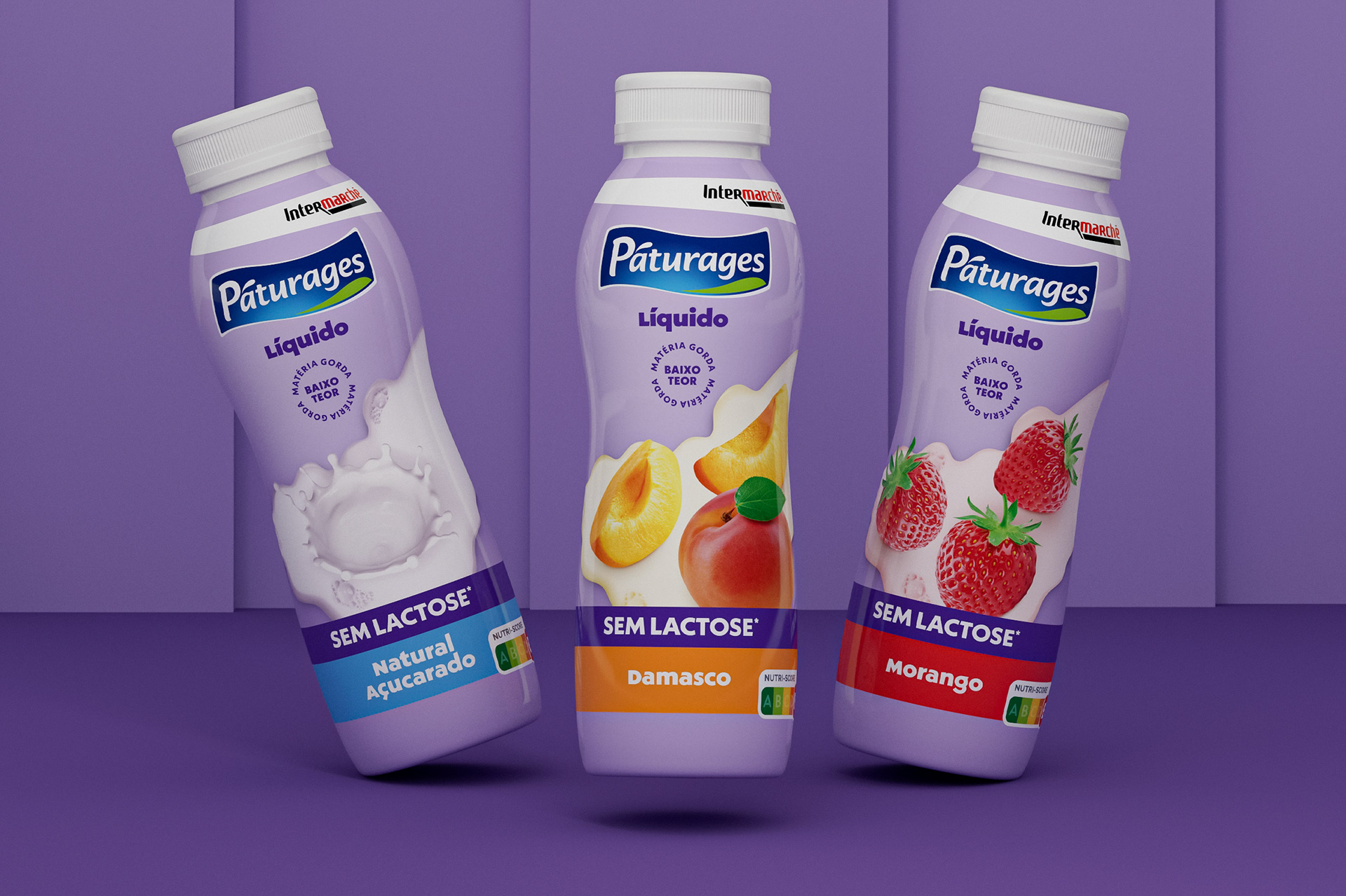
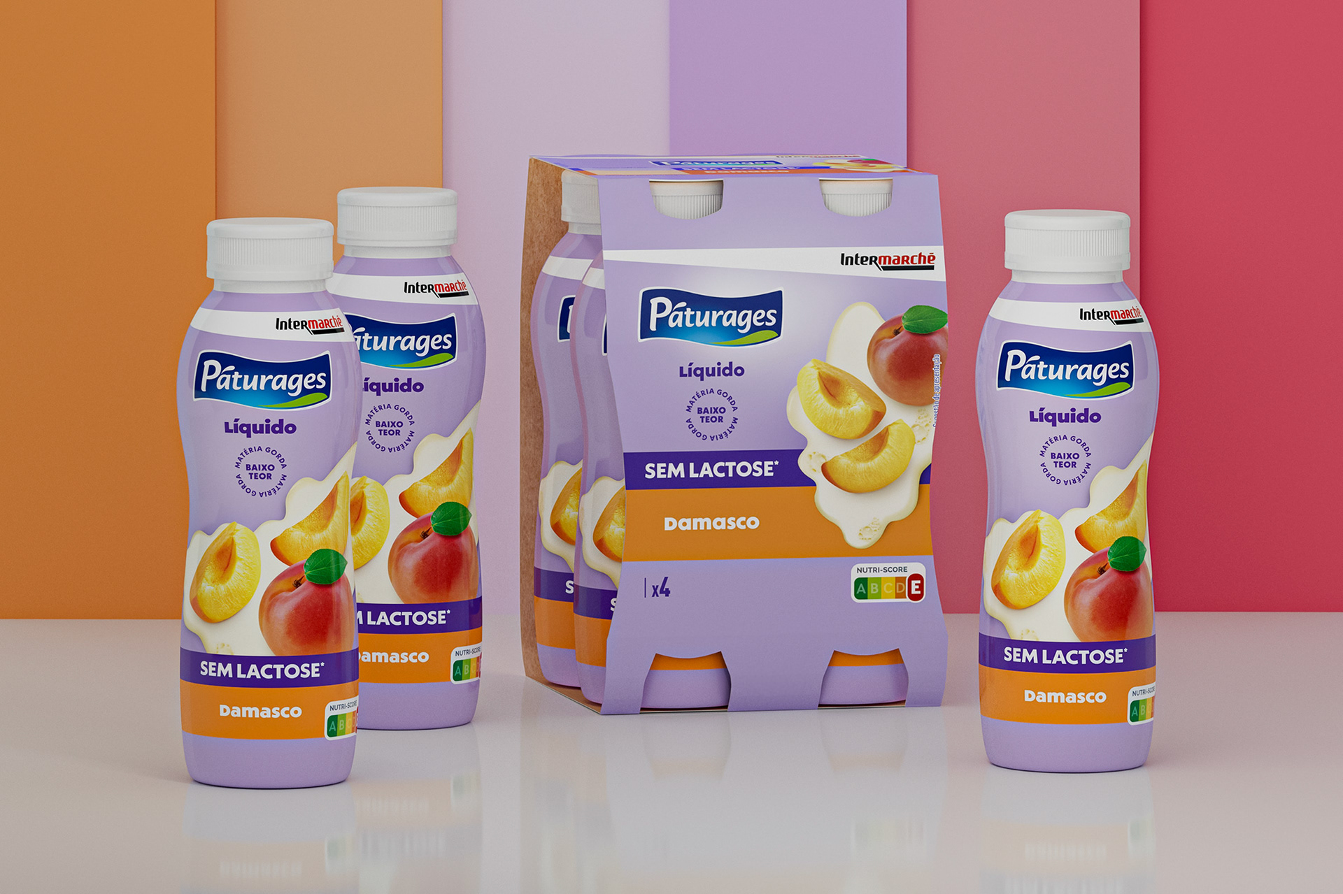
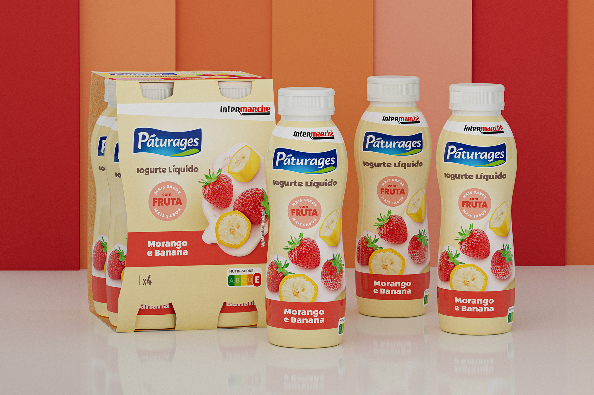
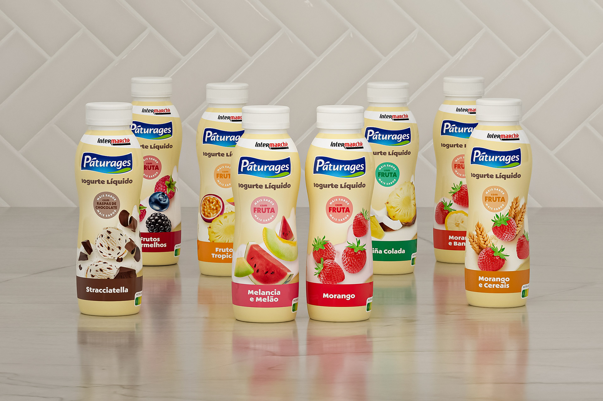
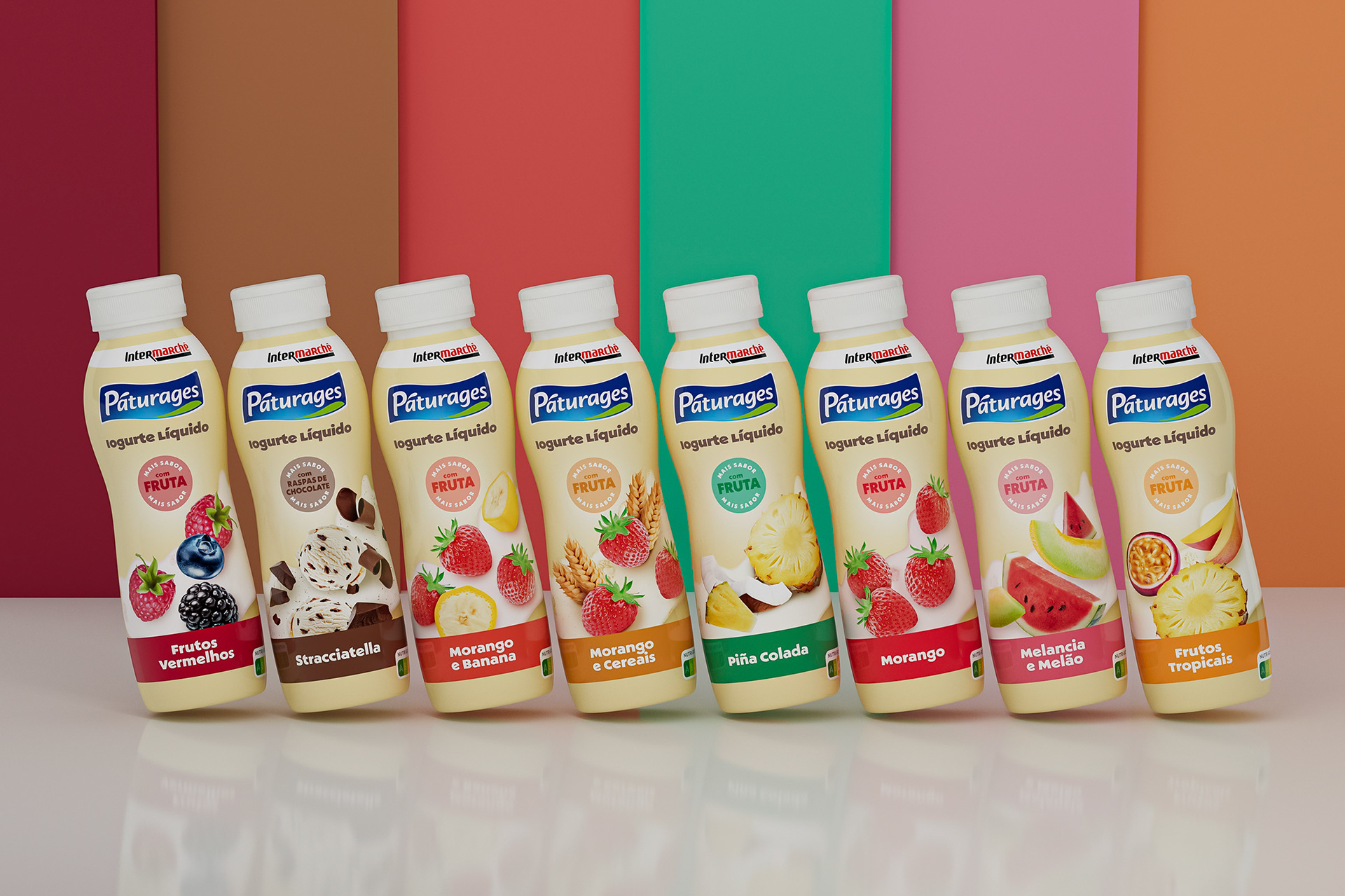
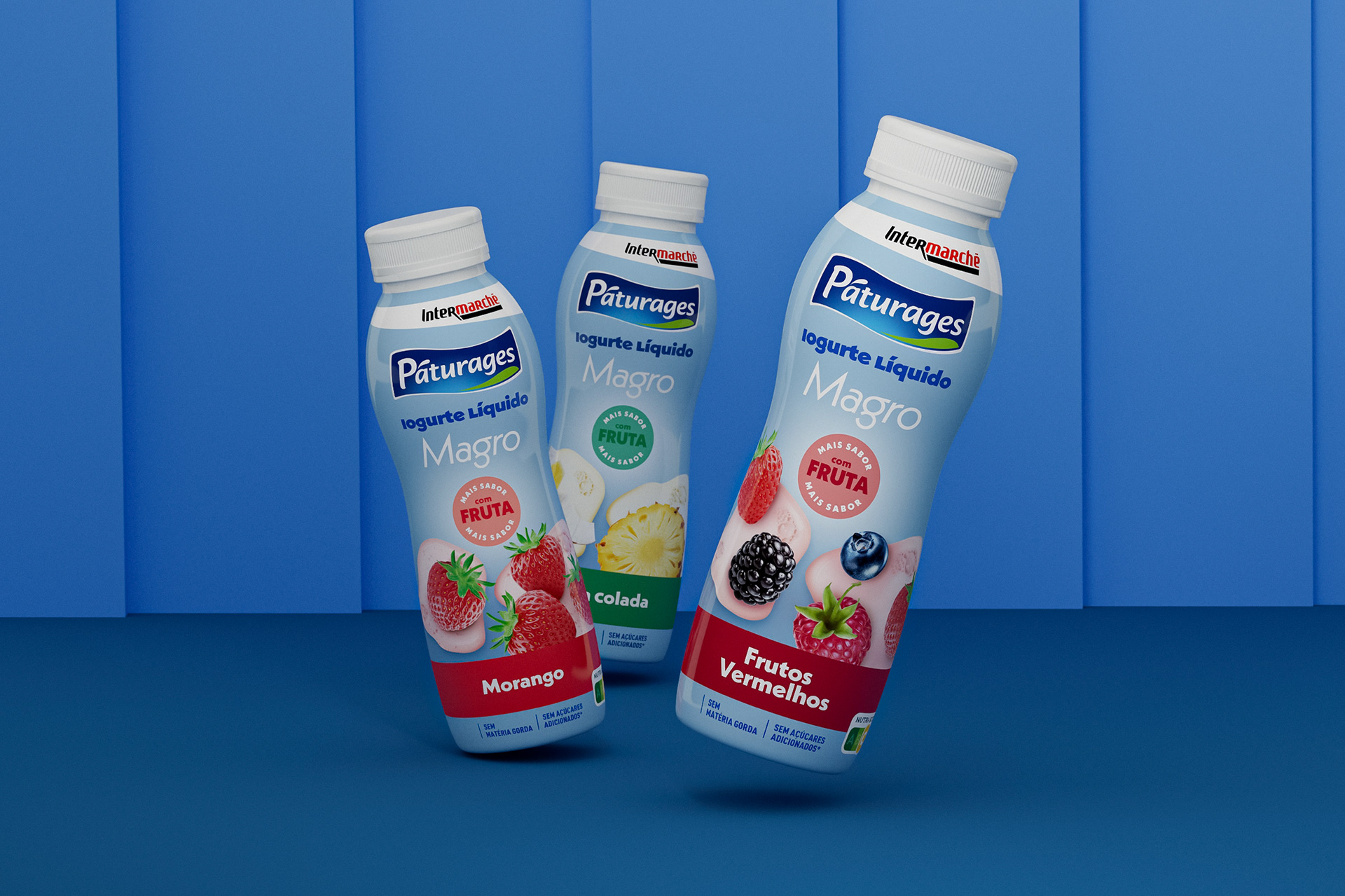
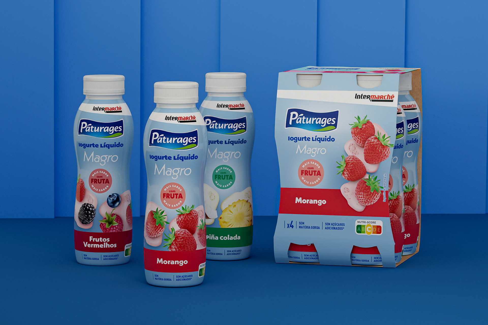
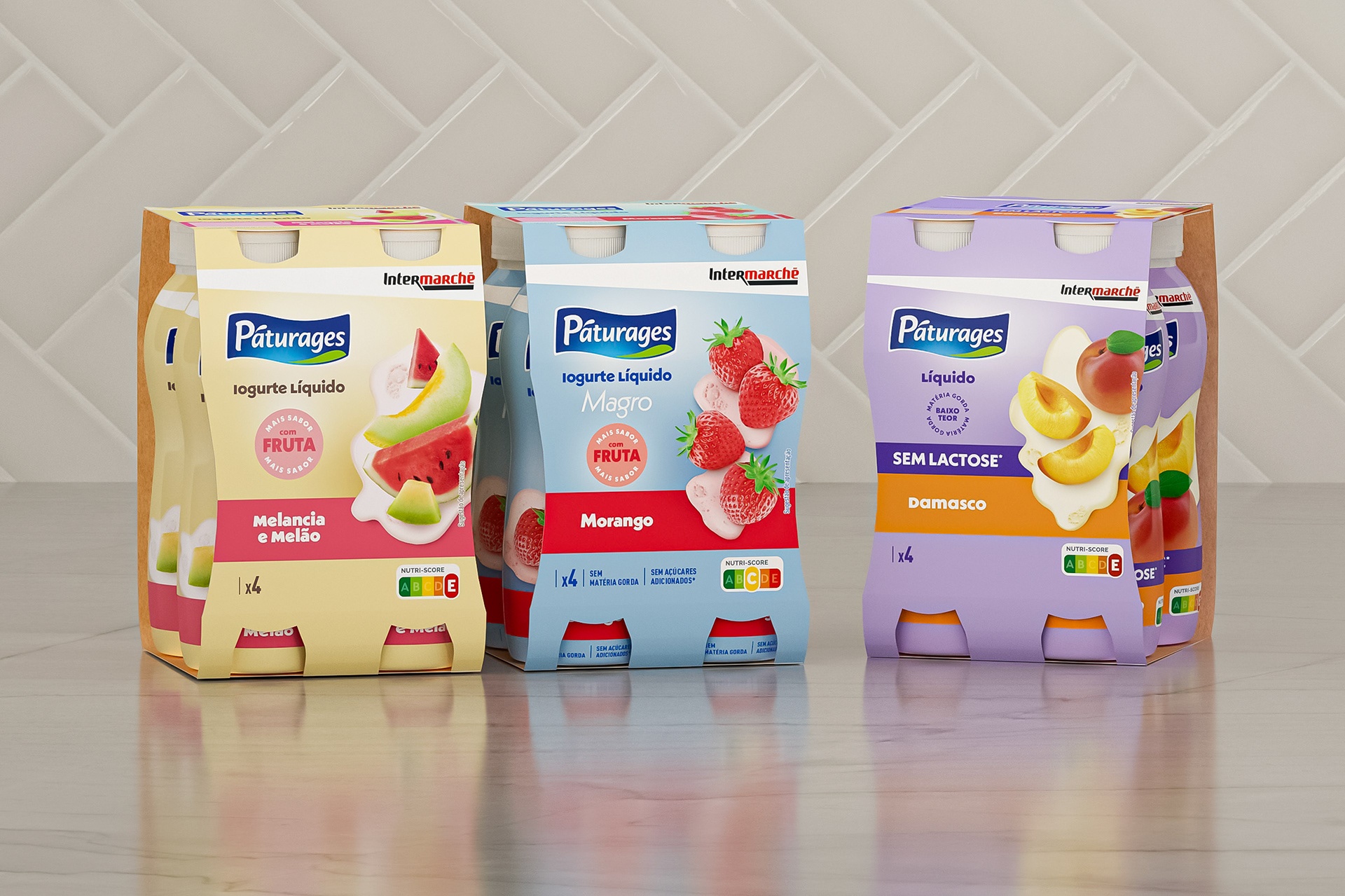
[EN] The new visual identity of Páturages liquid yogurts presents a modern, coherent, and distinctive look, enabling immediate recognition of the three lines that make up the range: Fruit Polme, Magro, and Lactose-Free. The chromatic strategy is the main element of differentiation on the shelf, with cream tones conveying creaminess and naturalness in the Fruit Polme line, blue communicating lightness and nutritional balance in the Magro line, and purple adding personality, modernity, and strong visibility to the Lactose-Free line. Across all variants, the fruit photography is central, realistic, and appealing, reinforcing the perception of flavor and quality. The typography is clean and well-structured, facilitating the identification of benefits and ensuring clarity in communication. The combination of distinct color palettes, balanced composition, and visual consistency makes the range easily recognizable, ensuring strong shelf impact and strengthening the brand’s positioning as a contemporary and carefully designed choice.
[PT] A nova imagem dos iogurtes líquidos Páturages apresenta uma imagem moderna, coerente e distintiva, permitindo uma leitura imediata das três linhas que compõem a gama: Polme de Fruta, Magro e Sem Lactose. A estratégia cromática é o principal elemento de diferenciação no linear, com o creme a transmitir cremosidade e naturalidade na linha Polme de Fruta, o azul a comunicar leveza e equilíbrio nutricional na linha Magro, e o roxo a conferir personalidade, modernidade e forte visibilidade à linha Sem Lactose. Em todas as referências, a fotografia de fruta é central, realista e apelativa, reforçando a perceção de sabor e qualidade. A tipografia é limpa e bem hierarquizada, facilitando a identificação dos benefícios e garantindo clareza na comunicação. A combinação entre paletas distintas, composição equilibrada e consistência visual torna a gama facilmente reconhecível, assegurando um destaque sólido no linear e fortalecendo o posicionamento da marca como uma escolha atual e graficamente cuidada.